

A parent searching for childcare in 2026 will visit an average of four to six provider websites before picking up the phone or filling out an inquiry form. Most of those visits last under a minute. If your site doesn’t immediately answer the questions running through a stressed parent’s mind, they close the tab and move on to the next option on Google. No email, no phone call, no tour scheduled: just gone.
The frustrating part? Your center might offer an incredible program. Your teachers might be exceptional. But none of that matters if your website drives families away before they ever learn about it. Understanding why parents leave your childcare website without contacting you is the first step toward fixing a problem most providers don’t even realize they have. These seven issues are the most common culprits, and every one of them is fixable.
The High Stakes of a Poor First Impression
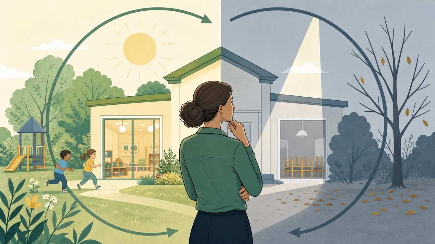
Think of your website as the lobby of your childcare center. If a parent walked into a physical space and saw peeling paint, dim lighting, and no one at the front desk, they’d turn around. Your website works the same way: except the decision happens in about three seconds instead of thirty.
A 2024 Stanford Web Credibility Research study found that 75% of users judge a business’s credibility based on its website design alone. For childcare providers, the stakes are even higher because parents are evaluating whether they’d trust you with their child. A dated layout, clashing colors, or a homepage cluttered with too much text sends an instant signal that the center may not be well-managed.
The first impression also sets the emotional tone. Parents searching for childcare are often anxious, time-pressed, and overwhelmed by options. A clean, warm, professional homepage with a clear call to action (“Schedule a Tour” or “See Our Programs”) reduces that anxiety. A confusing homepage amplifies it. One common mistake is treating the homepage like a brochure: cramming mission statements, event calendars, staff bios, and enrollment details all above the fold. That’s not welcoming. That’s overwhelming. The homepage has one job: make the parent want to learn more.
Hidden Pricing and Lack of Program Transparency
Nothing kills a parent’s interest faster than feeling like a center is hiding something. And the two things parents most want to know right away are cost and curriculum. When they can’t find either, they assume the worst: either it’s too expensive to advertise, or the program isn’t structured enough to describe.
The Frustration of Obscured Tuition Rates
A 2025 survey by ChildCare.net found that 68% of parents said they would not contact a childcare provider that didn’t list at least a tuition range on its website. Parents aren’t naive: they know rates vary by age group, schedule, and enrollment timing. But they want a ballpark. A simple table showing monthly ranges by classroom (Infants: 1,400-1,700/month, Toddlers: 1,200-1,500/month) does the job without locking you into a specific number.
The fear many directors have is that listing prices will scare families away. But here’s what’s actually happening: families who can’t find pricing assume your center is out of their budget and leave. You’re not protecting yourself from sticker shock. You’re filtering out families who might have been a perfect fit.
Missing Daily Schedules and Curriculum Details
Parents also want to understand what their child’s day will look like. A vague statement like “We provide a nurturing, play-based environment” tells them almost nothing. Compare that to a page that outlines morning circle time, structured learning blocks, outdoor play windows, and rest periods. The second version lets a parent picture their child in your care.
If you use a specific curriculum framework like Creative Curriculum, HighScope, or Reggio Emilia, name it. Educated parents will recognize these terms and feel reassured. Parents unfamiliar with them will appreciate the specificity. Either way, you’re building trust by showing you have a plan, not just a philosophy.
Schedule a FREE 30 minutes Session with Us!
Mobile Usability and Performance Bottlenecks
Here’s a number that should get your attention: over 70% of childcare website traffic in 2026 comes from smartphones. Parents are searching during lunch breaks, in pickup lines at older children’s schools, and while scrolling in bed at night. If your site doesn’t work well on a phone, you’re invisible to most of your audience.
Slow Load Times for Busy Parents
Google’s own research shows that 53% of mobile users abandon a site that takes longer than three seconds to load. Childcare websites are particularly vulnerable to this because they tend to be image-heavy. Large, uncompressed photos of classrooms and playgrounds look great on a desktop monitor but can bring a mobile connection to its knees.
The fix is straightforward: compress images (tools like TinyPNG or ShortPixel handle this in seconds), enable browser caching, and make sure your hosting plan can handle your traffic. If your site runs on WordPress, a caching plugin like WP Rocket or LiteSpeed Cache can cut load times in half. Test your site’s speed with Google’s PageSpeed Insights: anything below a score of 70 on mobile needs work.
Non-Responsive Design on Smartphone Screens
Slow speed is one problem. A layout that doesn’t adapt to smaller screens is another. If parents have to pinch and zoom to read your enrollment page, or if your navigation menu overlaps with your logo on an iPhone, you’ve lost them. Responsive design isn’t a luxury feature anymore: it’s the baseline expectation.
Check your site on at least three devices (a recent iPhone, a mid-range Android phone, and a tablet). Pay special attention to your contact form, tour scheduling button, and tuition page. If any of these are hard to use on a phone, those are your highest-priority fixes.
Absent Social Proof and Safety Indicators
Parents making childcare decisions are doing something deeply personal: choosing who will care for their child while they’re away. They want reassurance from other parents who’ve already made that choice, and they want proof that your center meets professional standards. When your website offers neither, it creates a trust gap that’s hard to overcome with pretty photos alone.
The Impact of Missing Parent Testimonials
Think of testimonials as word-of-mouth at scale. A 2025 BrightLocal consumer survey found that 87% of consumers read online reviews for local businesses, and childcare is no exception. But there’s a difference between having a few reviews on Google and featuring parent stories on your actual website.
The most effective testimonials are specific. “We love ABC Childcare!” is nice but forgettable. “My daughter went from being terrified of drop-off to running through the door every morning within two weeks. Ms. Janelle made all the difference.” That’s a story. That’s something a nervous parent reads and thinks, “Maybe my kid could feel that way too.” Aim for three to five testimonials on your homepage or a dedicated reviews page, ideally with first names and the child’s age group.
Lack of Visible Licensing and Security Badges
Your state license number, accreditation logos (NAEYC, NECPA, or your state’s quality rating), and safety certifications should be visible on every page: typically in the footer or on a dedicated “About Us” section. Parents may not consciously look for these, but their absence registers subconsciously as a red flag.
If your center has security cameras, keypad entry, or a specific check-in/check-out system, mention it. A short sentence like “All visitors must check in through our HiMama app and present photo ID at pickup” tells parents you take security seriously without sounding like a sales pitch.
Outdated Visual Content and Stock Photo Overuse
This is one of the biggest reasons parents leave childcare websites without reaching out, and it’s one of the easiest to fix. If your website’s photos show children using iPads from 2018, or if your “classroom” images are clearly stock photos of impossibly clean rooms with ethnically diverse children all smiling at the camera in matching outfits: parents notice.
Stock photos create distance. They signal that you’re either hiding what your center actually looks like or that you haven’t invested the time to showcase it. Neither interpretation builds confidence. Real photos of your actual classrooms, playground, and (with parent permission) children engaged in activities are worth ten times more than any stock image.
You don’t need a professional photographer, though hiring one for a half-day shoot once a year is a smart investment. A teacher with a decent smartphone can capture authentic moments: a toddler concentrating on a puzzle, a group of preschoolers planting seeds in a garden box, a teacher reading during circle time. These images tell a story that stock photos never will.
Update your photos at least twice a year. Seasonal images (fall art projects, summer water play) show that your center is active and current. A website with photos that clearly haven’t changed in two years suggests a program that might be equally stagnant.
Schedule a FREE 30 minutes Session with Us!
Complicated or Broken Contact Methods
You’ve done everything right: the parent likes your photos, trusts your testimonials, and can afford your tuition. Now they want to reach out. This is the moment of conversion, and it’s exactly where many childcare websites fumble.
Lengthy Inquiry Forms That Discourage Leads
If your contact form asks for the child’s full name, date of birth, desired start date, medical history, previous childcare experience, and a paragraph about why they’re interested: you’ve just turned a simple inquiry into a job application. Parents filling out forms on their phone during a work break will abandon anything longer than five fields.
Keep your initial inquiry form short: parent name, email, phone number, child’s age, and an optional message field. That’s it. You can collect everything else during the tour or follow-up call. The goal of the form is to start a conversation, not to complete enrollment.
Missing Click-to-Call and Direct Map Links
On mobile, your phone number should be tappable. Your address should link directly to Google Maps or Apple Maps. These sound like small details, but they remove friction at the exact moment a parent is ready to act. If someone has to copy your phone number, switch to their dialer, and paste it in, you’ve added three unnecessary steps. Some parents won’t bother.
Also check that your contact page actually works. Send a test inquiry through your own form every month. You’d be surprised how many childcare websites have forms that submit to a dead email address or a full inbox. A broken contact form is worse than no form at all because the parent thinks they’ve reached out and waits for a response that never comes.
Optimizing Your Digital Front Door for Conversions
Fixing these issues isn’t about becoming a web design expert. It’s about treating your website the way you’d treat your center’s physical entrance: keeping it clean, welcoming, informative, and easy to walk through.
Start with the three changes that typically have the biggest impact: add tuition ranges, replace stock photos with real images, and shorten your contact form. These alone can noticeably increase inquiry rates within weeks. Then tackle mobile speed, testimonials, and credential visibility as a second phase.
Set up a simple tracking system so you know what’s working. Google Analytics 4 is free and can show you how many visitors reach your contact page versus how many actually submit an inquiry. If 500 parents visit your site each month but only 8 fill out a form, that 1.6% conversion rate tells you there’s a leak in the funnel. Industry benchmarks for childcare websites hover around 3-5%, so anything below that means your site is actively losing you families.
The reasons parents leave childcare websites without making contact are rarely about your program. They’re about your presentation. Every tab a parent closes is a family you could have served: a child who could have thrived in your classrooms. Your website is often the only chance you get to make that first connection. Make it count.



Share