
In the competitive world of childcare, creating a strong and memorable brand is key to attracting parents and caregivers. One crucial aspect of building a brand is choosing the right colors. The colors you select can communicate a variety of messages and emotions, influencing how your brand is perceived. In this article, we will explore the importance of color in branding, how colors can influence perception, and how to identify and build your childcare brand’s color palette.
Understanding the Importance of Color in Branding
Color plays a significant role in shaping how people perceive and connect with a brand. It goes beyond aesthetics, as different colors can evoke different emotions and feelings. Understanding the psychology of colors is essential when choosing a color scheme for your childcare brand.
The Psychology of Colors
Colors have long been associated with different emotions and meanings. For example, blue is often associated with trust, stability, and calmness, making it a popular choice for healthcare and childcare brands. On the other hand, yellow is associated with energy, happiness, and warmth, which can be appealing for brands targeting young children.
How Colors Influence Perception
Colors can also influence how people perceive your brand. Bright and vibrant colors may attract attention and create a sense of excitement, while soft and muted tones can convey a more calming and nurturing environment. Consider the message you want to convey and choose your colors accordingly.
Moreover, cultural differences play a significant role in color perception. For example, while white is associated with purity and weddings in Western cultures, it symbolizes mourning and funerals in many Eastern cultures. Understanding the cultural context of colors is crucial when creating a global brand identity that resonates with diverse audiences.
Color Combinations and Brand Identity
When selecting colors for your childcare brand, consider how different color combinations can impact brand identity. Complementary colors, such as blue and orange, can create a dynamic and visually appealing look, while analogous colors, like green and yellow, can evoke a sense of harmony and unity. Experiment with various color schemes to find the perfect combination that reflects your brand’s values and personality.
Schedule a FREE 30 minute Session with Us!
Identifying Your Childcare Brand’s Identity
Before diving into the world of colors, it’s crucial to define your childcare brand’s identity. Take the time to articulate your brand’s mission and vision, as well as the values and qualities you want to be associated with your brand.
Establishing a strong brand identity for your childcare center is essential in creating a lasting impression on parents and children alike. Your brand’s identity encompasses not only its visual elements but also its core beliefs and the unique experience it offers. By defining your brand’s identity, you can effectively communicate what sets your childcare center apart from the competition.
Defining Your Brand’s Mission and Vision
Your brand’s mission and vision can serve as a guiding light when choosing colors. If your childcare brand aims to foster creativity and exploration, you may want to consider incorporating vibrant and playful colors into your palette. If your focus is on providing a safe and comforting environment, softer and more soothing colors might be more suitable.
When crafting your brand’s mission and vision, consider the impact you wish to have on the children in your care. Do you aspire to ignite a love for learning, promote inclusivity and diversity, or prioritize outdoor play and nature exploration? These key elements can influence not only the colors you choose but also the overall design and atmosphere of your childcare center.
Aligning Your Brand’s Personality with Color Choices
Consider your brand’s personality when selecting colors. Is it energetic and lively, professional and trustworthy, or nurturing and calm? Your chosen colors should reflect these traits, ensuring that they align with the overall brand image you wish to create.
Color psychology plays a significant role in how your brand is perceived by parents and children. Bright, bold colors like red and yellow can evoke feelings of energy and excitement, ideal for brands focused on active play and creativity. In contrast, soft pastel hues such as light blue and pale pink may convey a sense of tranquility and gentleness, suitable for brands emphasizing comfort and security.
The Role of Color in Childcare Settings
Colors can have a significant impact on children’s behavior and emotions. Understanding how different colors can influence children’s responses is crucial when designing your childcare setting.
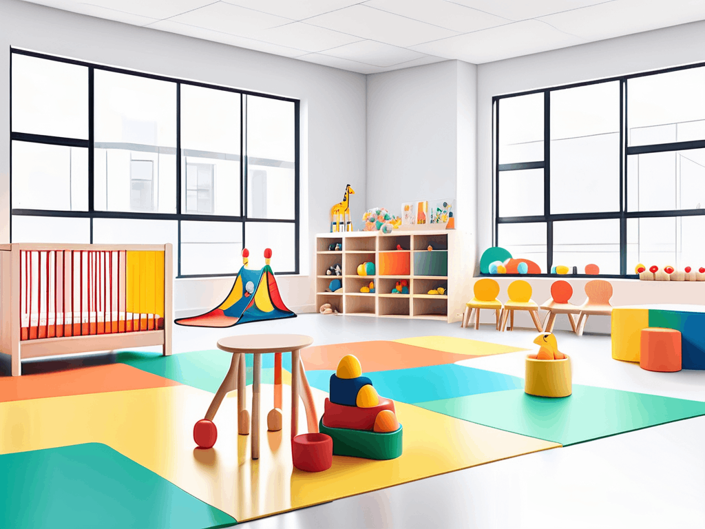
When creating a childcare environment, it’s essential to delve deeper into the psychology of colors and their effects on young minds. Each color has a unique impact on children, influencing their mood, energy levels, and overall well-being. By strategically incorporating colors into different areas of your childcare facility, you can create a harmonious and stimulating atmosphere for the children.
Schedule a FREE 30 minute Session with Us!
Colors and Their Impact on Children’s Behavior
When it comes to children, colors can evoke various emotions and even stimulate certain behaviors. For example, red is often associated with energy and excitement, making it a suitable color for play areas. In contrast, blue and green are known for their calming effects, making them suitable choices for rest areas or nap rooms.
Yellow, with its cheerful and uplifting qualities, can be a great choice for areas where creativity and learning are encouraged. Purple, often linked to imagination and creativity, can inspire children to explore their artistic side. By strategically combining these colors in different spaces within your childcare setting, you can create a dynamic and enriching environment for children to thrive.
Selecting Colors for Different Age Groups
It’s important to consider the age groups you will be caring for when choosing colors for your childcare brand. Younger children may respond better to bright and bold colors, while older children may appreciate more sophisticated and muted tones. Adjust your color palette accordingly to accommodate different age groups.
For infants and toddlers, soft pastel shades like light pink, baby blue, and mint green can create a soothing and nurturing ambiance. These gentle hues can help create a sense of calm and security, especially in areas like nurseries or quiet corners for nap time. On the other hand, preschoolers and school-age children may benefit from a more vibrant color scheme that energizes their space and fosters creativity and exploration.
Building Your Childcare Brand’s Color Palette
Once you have a clear understanding of your brand’s identity and the role of colors in your childcare setting, it’s time to create your brand’s color palette. The colors you choose will play a significant role in shaping the perception of your childcare center and connecting with your target audience on a visual level.
Color psychology is a powerful tool in branding, as different colors evoke specific emotions and associations. For a childcare brand, you may want to consider using warm and inviting colors like soft yellows, gentle greens, or calming blues to create a welcoming and nurturing environment for children and parents alike.
Primary and Secondary Colors for Your Brand
Start by selecting primary and secondary colors that represent your brand’s identity and resonate with your target audience. You can choose a combination of colors that work harmoniously together or complement each other, creating a visually appealing and cohesive brand image. Think about the message you want to convey through your colors – whether it’s creativity, trust, or playfulness.
Consider the age group of the children you cater to when choosing your colors. Bright and vibrant colors may be more suitable for younger children, while softer pastel tones could be calming for infants and toddlers. Your color palette should reflect the values and atmosphere you want to create within your childcare space.
Using Neutral Colors Effectively
While selecting your primary and secondary colors is crucial, don’t overlook the power of neutral colors. Neutral colors such as white, gray, or beige can serve as a backdrop, allowing your primary colors to stand out while providing balance and sophistication to your brand’s visual identity. These neutral tones can also help create a sense of cleanliness and professionalism, which are essential in a childcare setting.
When combining neutral colors with your primary and secondary palette, consider the overall balance and contrast to ensure that your brand’s visual identity remains cohesive and engaging. The strategic use of neutral colors can enhance the impact of your primary colors and create a harmonious visual experience for both children and parents who interact with your brand.
Schedule a FREE 30 minute Session with Us!
Implementing Your Color Scheme Across Your Brand
Once you have established your color palette, consistency is key in implementing your chosen colors across all aspects of your childcare brand.

Consistency in Using Your Brand Colors
Ensure that your brand colors are consistently used in all your marketing materials, website design, signage, and even staff uniforms. Consistency helps create a strong brand identity and fosters recognition and trust among parents and caregivers.
Adapting Your Color Scheme for Different Platforms
Keep in mind that your brand’s colors may need to be adapted when used in different formats or platforms. Colors may appear differently on various screens or in print, so make sure to test and adjust your color scheme accordingly to maintain consistency and integrity.
In conclusion, choosing the right colors for your childcare brand is a strategic decision that goes beyond aesthetics. Understanding the psychology of colors, aligning your brand’s identity with color choices, and considering the impact of colors on children’s behavior are all crucial steps in creating a strong and appealing brand. By building a well-designed color palette and implementing it consistently across all aspects of your brand, you can effectively communicate your brand’s values and create a lasting impression on parents and caregivers.


Share